


A chart pattern is a shape within a price chart that helps to suggest what prices might do next, based on what they have done in the past. Chart patterns are the basis of technical analysis and require a trader to know exactly what they are looking at, as well as what they are looking for.
How to Trade Chart Patterns - Quick Guide
- Learn the principles of technical trading at CAPEX Academy
- Sign up for a live account and gain access to thousands of shares, indices, ETFs, currency pairs, cryptocurrencies, and more
- Identify chart patterns using our comprehensive charting tools, including advanced Trading View charts
- Open and monitor your position
Not ready to trade with real capital? Open a demo account to trial your chart pattern strategy with $50,000 in virtual funds.
Introduction to Chart Patterns
Chart patterns are another technical indicator and form of support and resistance lines. The two styles most widely followed are Japanese candle and Western-style chart patterns.
A few key differences exist between them:
- Scope: Though Western chart patterns can serve as the centerpiece of certain trading strategies, Japanese candle patterns are not intended to comprise a stand-alone trading system; instead, they confirm or are confirmed by other technical indicators. Japanese candle patterns typically forecast what happens over the next few candles, whereas Western patterns can suggest longer-term movements covering a longer period and can suggest specific price targets.
- Pattern types: Japanese candle charts mostly indicate reversal or indecision, whereas Western charting patterns tend to indicate continuation (trend pausing before resuming) or reversal.
What both kinds of chart patterns share is that both are useful because:
- They help us understand market sentiment and are easy to interpret because they make sense. For example, it’s intuitively clear that candles consisted solely of long bodies with no wick, meaning that price went straight up or down, suggesting strong, decisive bullish, or bearish sentiment with buyers or sellers in control. Candles consisted solely of upper and lower wicks, with only a line for a body, show price moved back and forth but ended almost unchanged. They suggest indecisiveness or a balance of power between buyers and sellers.
- Both kinds of chart patterns present graphic images of mass trader psychology, which does not change over time, hence these patterns do tend to repeat and are valid indicators of support/resistance points and how prices may behave in the future.
Chart patterns fall broadly into three categories: continuation patterns, reversal patterns, and bilateral patterns.
- A continuation signals that an ongoing trend will continue
- Reversal chart patterns indicate that a trend may be about to change direction
- Bilateral chart patterns let traders know that the price could move either way – meaning the market is highly volatile
For all of these patterns, you can take a position with CFDs (contracts for difference). This is because CFDs enable you to go short as well as long – meaning you can speculate on markets falling as well as rising. You may wish to go short during a bearish reversal or continuation, or long during a bullish reversal or continuation – whether you do so depends on the pattern and the market analysis that you have carried out.
Japanese Candle Chart Patterns
Candle patterns are a vast topic. Our goal here is to briefly present you with the most important among them. Read our comprehensive candlestick chart course for more insights.
Bullish candlestick patterns
Bullish patterns may form after a market downtrend and signal a reversal of price movement. They are a chart pattern indicator for traders to consider opening a long position to seek profit from any upward trajectory.
- Hammer
- Inverse hammer
- Bullish engulfing
- Piercing line
- Morning star
- Three white soldiers
Bearish candlestick patterns
Bearish candlestick patterns usually form after an uptrend and signal a point of resistance. Heavy pessimism about the market price often causes traders to close their long positions and open a short position to take advantage of the falling price.
- Hanging man
- Shooting star
- Bearish engulfing
- Evening star
- Three black crows
Continuation candlestick patterns
If a candlestick pattern does not indicate a change in market direction, it is what is known as a continuation pattern. These can help traders to identify a period of rest in the market when there is market indecision or neutral price movement.
- Doji
- Spinning top
- Falling three
- Rising three
Western chart patterns
Like Japanese candle patterns, Western chart patterns are indicators and forms of support and resistance.
Western chart patterns are commonly classified as reversal or continuation patterns, but these are rough generalizations that help us organize these patterns in our minds. Reversal patterns are often not followed by trend reversals, and continuation patterns are often followed by breakouts up or down.
This section will just introduce the most widely followed Western chart pattern list (as opposed to those of Japanese candle charts). As with candle charts, this topic is vast, and each chart pattern is detailed in its own article (just click on the link). The following is meant to present the most powerful chart pattern list you should learn.
As with candlestick patterns, you will have a much easier time remembering what these chart patterns mean if you understand the logic behind them.
Classic Western Reversal Chart Patterns
Here are some of the most powerful reversal chart patterns in forex trading, stock trading, futures trading, and even cryptocurrency trading, indicating that a trend may be about to change direction.
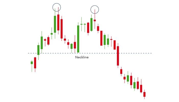
Head and shoulders


Head and shoulders is a chart pattern in which a large peak has a slightly smaller peak on either side of it. Traders look at head and shoulders patterns to predict a bullish-to-bearish reversal.
Typically, the first and third peaks will be smaller than the second, but they will all fall back to the same level of support, otherwise known as the ‘neckline’. Once the third peak has fallen back to the level of support, it is likely that it will breakout into a bearish downtrend.
Double top
A double top is another pattern those traders use to highlight trend reversals. Typically, an asset’s price will experience a peak, before retracing back to a level of support. It will then climb up once more before reversing back more permanently against the prevailing trend. The same logic applies to a triple top.
Double bottom
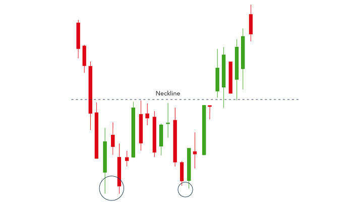
A double-bottom chart pattern indicates a period of selling, causing an asset’s price to drop below a level of support. It will then rise to a level of resistance, before dropping again. Finally, the trend will reverse and begin an upward motion as the market becomes more bullish.
A double bottom is a bullish reversal pattern because it signifies the end of a downtrend and a shift toward an uptrend. The same logic applies to a triple bottom.
Rounding bottom

A rounding bottom chart pattern can signify a continuation or a reversal. For instance, during an uptrend, an asset’s price may fall back slightly before rising once more. This would be a bullish continuation.
An example of a bullish reversal rounding bottom – shown below – would be if an asset’s price was in a downward trend and a rounding bottom formed before the trend reversed and entered a bullish uptrend.
Traders will seek to capitalize on this chart pattern by buying halfway around the bottom, at the low point, and capitalizing on the continuation once it breaks above a level of resistance.
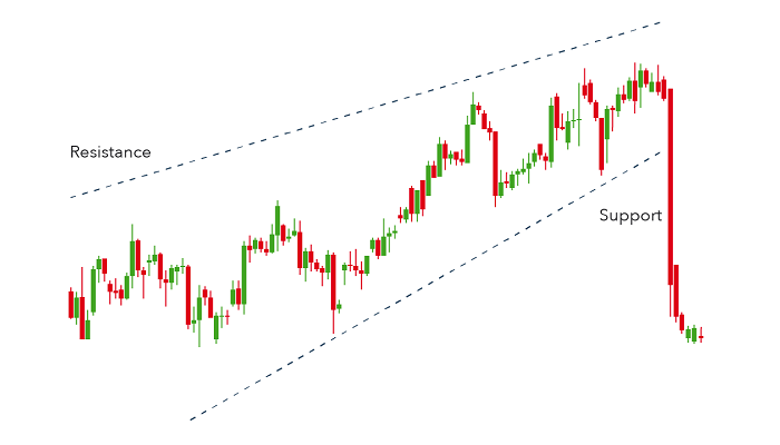
Wedges
Wedges form as an asset’s price movements tighten between two sloping trend lines. There are two types of wedges: rising and falling.
A rising wedge is represented by a trend line caught between two upwardly slanted lines of support and resistance. In this case, the line of support is steeper than the resistance line. This pattern signals that an asset’s price will eventually decline more permanently – which is demonstrated when it breaks through the support level.
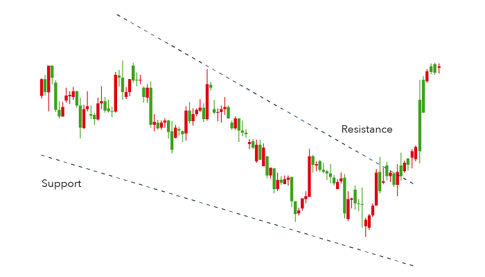
A falling wedge occurs between two downwardly sloping levels. In this case, the line of resistance is steeper than the support. A falling wedge is usually indicative that an asset’s price will rise and break through the level of resistance, as shown in the example below.
Both rising and falling wedges are reversal patterns, with rising wedges representing a bearish market and falling wedges being more typical of a bullish market.
Classic Western Continuation Patterns
Let’s get familiar with some classic Western continuation patterns. As the name suggests, these patterns imply trend continuation rather than reversal.
Studies have shown that the longer the price pattern takes to develop, and the larger the price movement within the pattern, the more significant the move once the price breaks above or below the area of continuation. To spot them, though, you’ll need a trading platform with powerful charting tools: such as the CAPEX platform WebTrader or MetaTrader 5.
Cup and handle
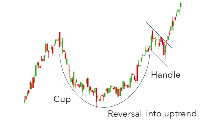
The cup and handle pattern is a bullish continuation pattern that is used to show a period of bearish market sentiment before the overall trend finally continues in a bullish motion. The cup appears similar to a rounding bottom chart pattern, and the handle is similar to a wedge pattern.
Following the rounding bottom, the price of an asset will likely enter a temporary retracement, which is known as the handle because this retracement is confined to two parallel lines on the price graph. The asset will eventually reverse out of the handle and continue with the overall bullish trend.
Pennant or flags
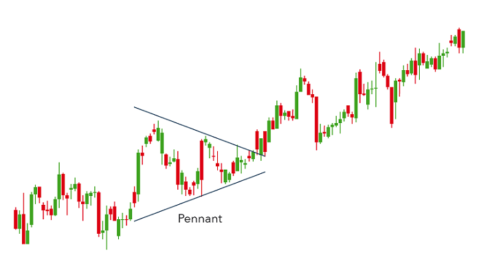
Pennant patterns, or flags, are created after an asset experiences a period of upward movement, followed by a consolidation. There will be a significant increase during the initial stages of the trend before it enters a series of smaller upward and downward movements.
Pennants can be either bullish or bearish, and they can represent a continuation or a reversal. The above chart is an example of a bullish continuation. In this respect, pennants can be a form of the bilateral pattern because they show either continuations or reversals.
While a pennant may seem like a wedge pattern or a triangle pattern – explained below – it is important to note that wedges are narrower than pennants or triangles. Also, wedges differ from pennants because a wedge is always ascending or descending, while a pennant is always horizontal.
Ascending triangle
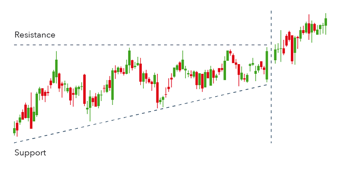
The ascending triangle is a bullish continuation pattern that signifies the continuation of an uptrend. Ascending triangles can be drawn onto charts by placing a horizontal line along with the swing highs – the resistance – and then drawing an ascending trend line along with the swing lows – the support.
Ascending triangles often have two or more identical peak highs which allow for the horizontal line to be drawn. The trend line signifies the overall uptrend of the pattern, while the horizontal line indicates the historic level of resistance for that particular asset.
Descending triangle
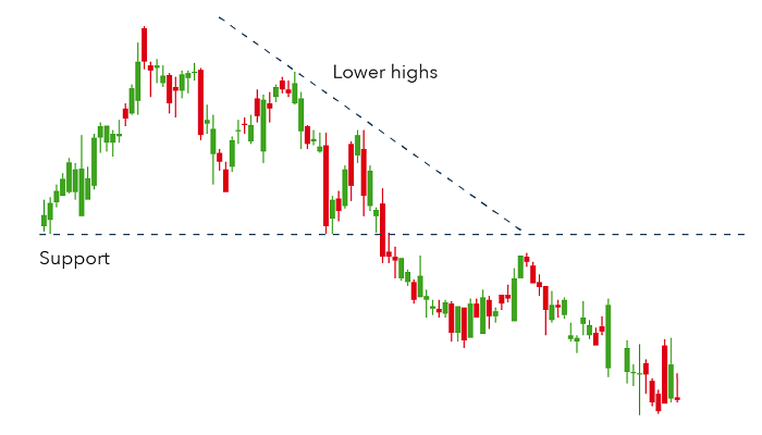
In contrast, a descending triangle signifies a bearish continuation of a downtrend. Typically, a trader will enter a short position during a descending triangle to profit from a falling market.
Descending triangles shift lower and break through the support because they are indicative of a market dominated by sellers, meaning that successively lower peaks are likely to be prevalent and unlikely to reverse.
Descending triangles can be identified from a horizontal line of support and a downward-sloping line of resistance. Eventually, the trend will break through the support and the downtrend will continue.
Chart Patterns That Can Be Continuation or Reversal
These can serve as reversal or continuation patterns. What they share is that the price range converges into a narrower range until the price breaks out either in the direction of the trend (continuation) or in the opposite direction (reversal).
Symmetrical triangle
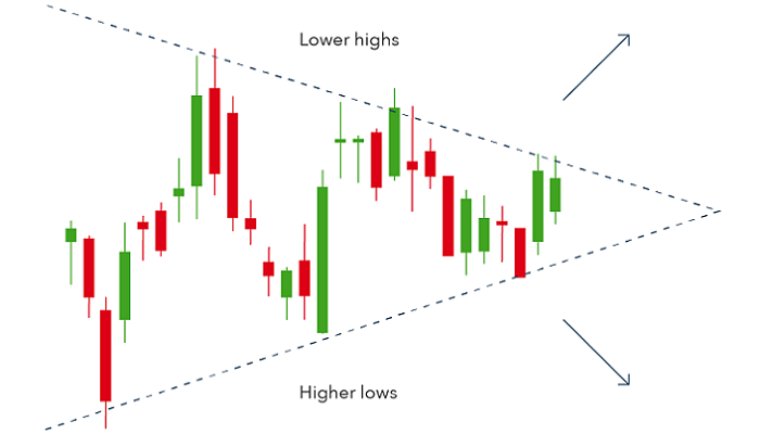
The symmetrical triangle pattern can be either bullish or bearish, depending on the market. In either case, it is normally a continuation pattern, which means the market will usually continue in the same direction as the overall trend once the pattern has formed.
Symmetrical triangles form when the price converges with a series of lower peaks and higher troughs. In the example below, the overall trend is bearish, but the symmetrical triangle shows us that there has been a brief period of upward reversals.
However, if there is no clear trend before the triangle pattern forms, the market could break out in either direction. This makes symmetrical triangles a bilateral pattern – meaning they are best used in volatile markets where there is no clear indication of which way an asset’s price might move. An example of a bilateral symmetrical triangle can be seen below.
Chart Patterns Trading Tips
- Chart patterns don’t come about by magic, they’re pictures of unchanging crowd psychology. The patterns repeat because crowd behavior repeats when subject to fear, greed, and indecision, as these feelings permeate the markets in response to current events and how markets interpret them based on their prior expectations.
- By recognizing these patterns, you’re better able to anticipate the support/resistance levels these patterns create. These patterns are widely recognized. As with any widely followed kind of support/resistance, you need to be aware of it to anticipate the support/resistance levels. In other words, a chart pattern indicator is another way of anticipating what the crowd is likely to do.
- It’s important to determine whether the market is trading or consolidating. This is because it will reveal what type of chart patterns work best for each trading environment.
- Look at the whole price picture, don't just focus on the chart patterns. What you need is for this story to confirm your price action pattern. Everything else must point in the same direction. Finding the proper direction to place your trades will help you to increase your win rate, under normal market conditions.
- Chart patterns work best in conjunction with a good price location which can add confluence to your trade. That price location can either be a support/resistance level, swing high/low points or some pivot points. The location can even be a technical indicator if you combine the two.
- Finally, a chart pattern trading strategy requires written trading rules that can be adjusted along with changing market conditions
Free Resources
Before you start trading chart patterns, you should consider using the educational resources we offer like CAPEX Academy or a demo trading account. CAPEX Academy has lots of free trading courses for you to choose from, and they all tackle a different financial concept or process – like the basics of analyses – to help you to become a better trader or make more-informed investment decisions.
Our demo account is a suitable place for you to get an intimate understanding of how trading and investing work – as well as what it’s like to trade with leverage – before risking real capital. For this reason, a demo account with us is a great tool for investors who are looking to make a transition to leveraged securities.